Art is hard.
Album art is very important.
The first thing you see in a record/cd store is the art on the cover. It can be eye-catching, or it can blend in. I feel like the slow transition to on-line music stores is actually sounding the deathknell of well-constructed album art. I've always felt a good cover can do many things: contrast the music within, add to it, comment on it, comment on the themes of the work, anything. So, with that said: these are my top 10 favorite album covers ever.
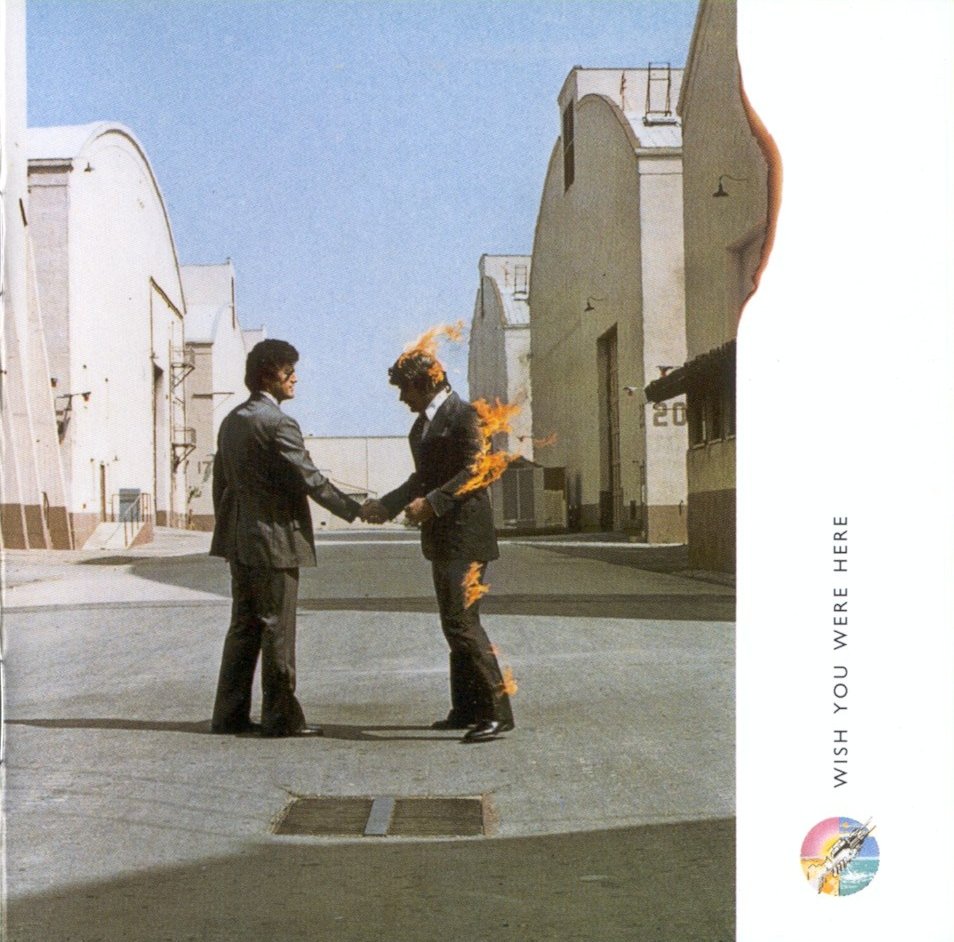
 1. Pink Floyd - Wish You Were Here
I wrote a paper for an art class about the symbolism and composition of this cover. I lost it though, so you're lucky to not be subjected to it. In any event, this is my favorite album cover ever.
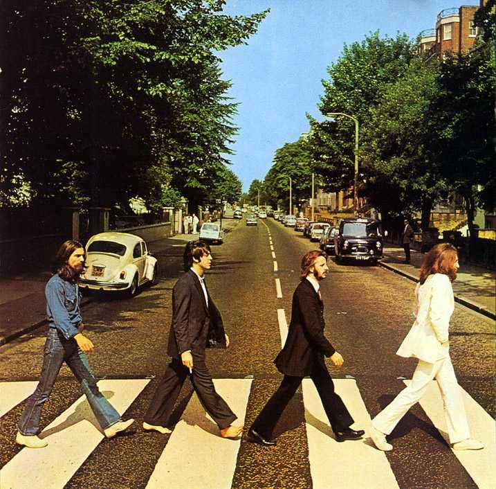
 2. the Beatles - Abbey Road
Paul's barefoot, because Paul is dead.
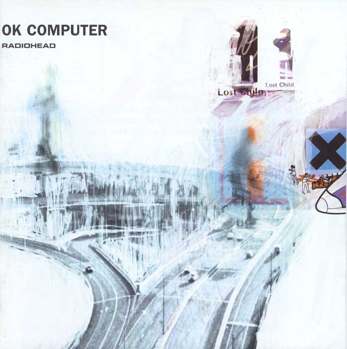
 3. Radiohead - OK Computer
Moreso than just the front cover art, the entire package is amazing on an aesthetic level. Little written messages in the spine, and a visual representation of the alienation contained therein. Good stuff.
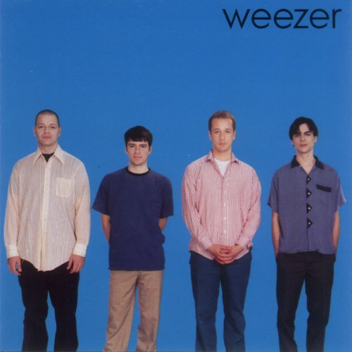
 4. weezer - weezer (blue album)
Simple band shot against a blue background. Like the music, not too complicated, but memorable.
 5. Spinal Tap - Smell the Glove
Its like, how much more black could this be? And the answer is: None. None... more black.
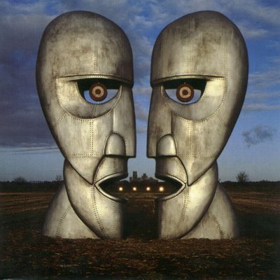 6. Pink Floyd - The Division Bell
Anyone who talks to me about movies and art knows I'm a sucker for extreme symmetry, and this is a perfect example of such. Its also a visual representation of the album's themes of the breakdown in communication between individuals. Notice: 2 figures, 2 open mouths, and line between them... but no ears
 7. Midtown - Forget What You Know
This is the newest cover on my list, a visual portrait of the loneliness and alienation in American society. "So long as we keep our bodies numb we're safe."
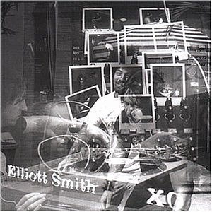 8. Elliott Smith - XO
I like the transparent reflection. And its Elliott. Simple as that.
 9. The Streets - A Grand Don't Come for Free
I don't know what it is about this one, but the colors, combined with the slightly asymmetrical design, just catch my eye and make for a striking image.
 10. Jets to Brazil - Perfecting Loneliness
You think I'd make a music-related list and leave out my favorite album of all time? What a wonderful painting, perfectly capturing the mood of the entire album contained therein.
Ok. and here's one for the hell of it. I have a poster of it, and its such a wonderful concept put into practice.
 It'd be pretty cool to see what all of yours are. Why not post your own list?
The first thing you see in a record/cd store is the art on the cover. It can be eye-catching, or it can blend in. I feel like the slow transition to on-line music stores is actually sounding the deathknell of well-constructed album art. I've always felt a good cover can do many things: contrast the music within, add to it, comment on it, comment on the themes of the work, anything. So, with that said: these are my top 10 favorite album covers ever.
 1. Pink Floyd - Wish You Were Here
I wrote a paper for an art class about the symbolism and composition of this cover. I lost it though, so you're lucky to not be subjected to it. In any event, this is my favorite album cover ever.
 2. the Beatles - Abbey Road
Paul's barefoot, because Paul is dead.
 3. Radiohead - OK Computer
Moreso than just the front cover art, the entire package is amazing on an aesthetic level. Little written messages in the spine, and a visual representation of the alienation contained therein. Good stuff.
 4. weezer - weezer (blue album)
Simple band shot against a blue background. Like the music, not too complicated, but memorable.
 5. Spinal Tap - Smell the Glove
Its like, how much more black could this be? And the answer is: None. None... more black.
 6. Pink Floyd - The Division Bell
Anyone who talks to me about movies and art knows I'm a sucker for extreme symmetry, and this is a perfect example of such. Its also a visual representation of the album's themes of the breakdown in communication between individuals. Notice: 2 figures, 2 open mouths, and line between them... but no ears
 7. Midtown - Forget What You Know
This is the newest cover on my list, a visual portrait of the loneliness and alienation in American society. "So long as we keep our bodies numb we're safe."
 8. Elliott Smith - XO
I like the transparent reflection. And its Elliott. Simple as that.
 9. The Streets - A Grand Don't Come for Free
I don't know what it is about this one, but the colors, combined with the slightly asymmetrical design, just catch my eye and make for a striking image.
 10. Jets to Brazil - Perfecting Loneliness
You think I'd make a music-related list and leave out my favorite album of all time? What a wonderful painting, perfectly capturing the mood of the entire album contained therein.
Ok. and here's one for the hell of it. I have a poster of it, and its such a wonderful concept put into practice.
 It'd be pretty cool to see what all of yours are. Why not post your own list?
Labels: music
posted by nicholas reed at 1:51 AM
![]()
![]()


2 Comments:
I feel as if I've read this before?
oh great
you post and don't tell me
well i'll get around to album covers once i get through these two blog entries
Post a Comment
<< Home